Brand
Corporate Identity Guide for BiP
Not only is BiP a communication application with millions of users, but it is also a design-driven brand. BiP is a reliable, friendly, and solution-oriented platform that connects all of its users in 192 different countries.

Use of logo
 Use of logo on blue background
  Use of logo on a white background
  Use of logo on dark-colored mixed background
  Use of logo on light-colored mixed background
 Our colors
With its primary and subsidiary corporate colors, BiP is always vibrant and friendly!
Our main corporate colors
Blue
#0DB2FF
#0DB2FF
Yellow
#FBE03C
#FBE03C
White
#FFFFFF
#FFFFFF
Our auxiliary corporate colors
Dark Blue
#0014F2
#0014F2
Orange
#FF8500
#FF8500
Usage of the Name
When writing the name of BiP, the letter “i” is always written in lower case (minuscule).

BiP

BİP Bip bip
Screenshots
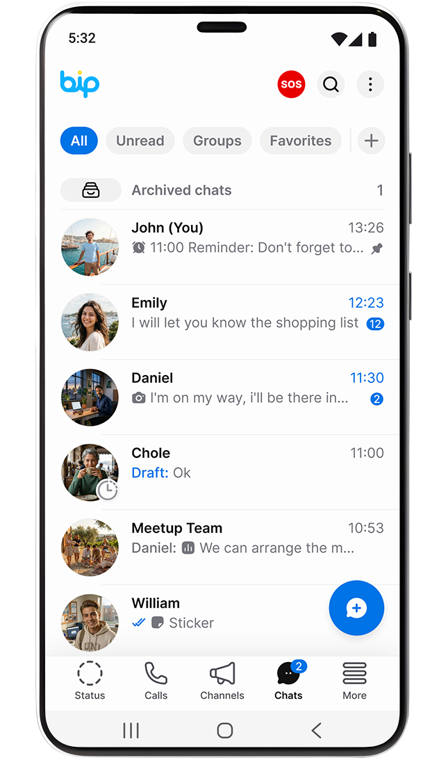
When BiP is required to use sample screenshots, these screens should be used as a guide.